|
| |
 |
|
||
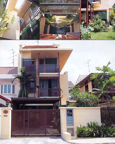
| : 21 ELITE PARK in review |
|
| In A Vertical Order In a shade of pale orange, the three-storey no 21 Elite Park is eye-catching without being superfluous. The corner terrace house is sited on a plot of land relatively broader than its neighbours' and has the advantage of a wider frontage. With its linear composition on a lean and longish rectangular frame, timber windows and sunshading screens, it looks curiously like a modern interpretation of a traditional shophouse. Endowing it in no small measure is the beautiful front garden. This joyfully flourishing garden is the pride and joy of the owners, Kelvin and Sue Khong, who tend and maintain it themselves. Sue, a horticulture enthusiast, handpicked every single plant and tree, and personally put them in their respective place. The sensitive treatment in the heights and types of the plants perfectly complemented the house. Such amazing expertise can easily fool one into believing that the garden is the work of a professional landscape artist! According to the architect of the house, Yip Yuen Hong of HYLA, the job was actually meant to be an A&A (Addition and Alteration) one, but would mean keeping the master bedroom at the back due to the limitations of the existing layout. So Kelvin and Sue opted to tear down the existing house and rebuild another one instead. Said Sue: 'We didn't think we could live with that idea (of the bedroom being at the back). We thought that it would make more sense to rebuild the whole house for the good of the long-run, which means more space, more design and altogether a nicer place to live in.' Added Kelvin: 'Anyway, I thought the architect will do a better job as they all love to start afresh.' Yuen Hong couldn't have been happier to be so blessed with such open-mindedness and reception. The young couple had complete faith in him, trusting the entire project in his hands with minimal intervention. The basic planning principle of the house is very simple: the house is first vertically zoned - vertical planes (walls) are inserted into the rectangular shell of the house (imagine a triple volume rectangular box). Each floor is then 'slotted' in. All the floor plans are systematically ordered by a row of evenly-spaced lines that cuts up the length of the plans into five sections, or rather, five equally sized rectangles. These rectangles, in turn, rule the layout of the interior spaces. In essence, the house is all about the interlocking of planes for the occurrence of space. The planes determine the spaces instead of the spaces ruling the planar placements. Although to some people, the introduction of planes before spaces might seem like an imposing condition that could limit the potential of the house in terms of spatial variety. The rectangular floor plan of the house is sliced into two by a grey wall (literally grey in colour) which runs parallel to the long axis. All the living spaces (bedrooms, living room and dining room) are tucked to the right of this wall, and the 'service spaces' (staircases, toilets) are kept on the left side (see floor plans). Its presence would otherwise give an intrinsically strong visual axis that cuts through the length of the house, if not for the intrusion of the courtyard that butts into the right perimeter wall midway along the long axis. The courtyard aligns itself with the staircore along the short axis of the house, marking an obvious physical centre. The kitchen and yard are systematically placed at the back, fitting into the rear rectangle. This change of function is indicated by a blue wall (literally, a wall painted blue). Both the grey and the blue walls, in a theoretical sort of way, could be read as two crucial 'elements' rather than just wall. |
The other two walls that enclose the central rectangle,
being given the same faded orange tone, is blended in with the rest of
the house, subtly reducing this zone's conceptual importance. Perhaps
they are not meant to be read as 'two walls' but more as one single element,
considering that both the external courtyard and the staircore are essentially
one big volume of void space meant to be read as a rectangular core (see
floor plans). This core penetrates the centre of the house, creating an
architectural focus that visually punctuates the longish space. These
'elements ' metaphorically and physically section out the 'territories'
of the house, with functional changes indicated literally by colour. In short, a conceptual model of the house stripped of all the nitty gritty details will be the four perimeter walls, the grey wall, the blue wall and the rectangular core. The three floors are then simply slotted in, camouflaging all conceptual contents and making it a very livable house. One observes that the design of the house is controlled by the vertical sectioning of the spaces. This abstraction is played up further with the employment of tectonic details that artfully enforce this play of vertically planes. The most striking one has got to be the slender metal railings of the staircase that runs from the first to the third storey. A huge timber screen which shields off the courtyard from the east sun could also be read as a unifying element on the East elevation. Another exclusive detail is the sunshading device made of steel and sails (the same kind used in yachts) that keeps the backyard from the sun - sensitive introduction of a soft element to 'close up' the rear rectangle. The idea of verticality is explicitly executed in the composition of the North (front) elevation. In fact, the font elevation is essentially a geometric composition of four rectangles; three standing vertically on a base of a horizontally placed one. An interesting point about the house is in the adaptation of details, apart from spatial and elevational treatment, from traditional shophouses. From the timber louvered French windows, to the exposed timber purlins on the underside of the top floor, to the cement screeded floors and timber railings, these are all improvised from Chinatown shophouses. Conventional glass-louvered windows are readapted as timber-louvered windows with all the aluminum mechanisms painted black to give a modern feel to an old sunshading system. 21 Elite Park can be taken as a perfect example of regionalism in architecture. Its design is a synthesis of the traditional and contemporary, one that simultaneously encompasses culture, practicality, spatial concept, sensitivity to the local climate, and aesthetics. Fundamentally, this house is the epitome of a simple concept well executed, in which spaces revolve around simple floor plans with crystal clear intentions and excellent details. |
Reprinted with permission from: ID Vol 16.no3 Jun/Jul 98 Writer: Kelly Cheng Photography: C I & A |
|
| View Flash Version (Macromedia Flash Player required) | Download Flash Player | back to top |