|
| |
 |
|
| : 158 EMERALD HILL ROAD in review |
|
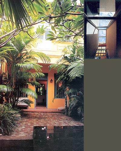
| 158 Emerald Hill This project comprising 3 storeys and a basement was an exercise in conserving a traditional shophouse on Emerald Hill Road with the view of adaptive reuse. The owners were drawn to the area for its distinctive ambience as well as its prime location and investment value. It is also probable that the purchase was prompted by a hint of nostalgia, one of them having Peranakan roots and Emerald Hill Road being synonymous as it is with Peranakan culture. The shophouse is located at the "top" (northernmost) end of Emerald Hill Road. It is characterised by an open verandah fronting the street and a steeply sloping site so that whilst the front façade is a two-storey façade, the rear accommodates basement level rooms, a utility area and a yard which acts as a buffer to the noise generated by traffic along the entrance to the Central Expressway below. The lot is 5.5m wide and is approximately 35m long. The original house, built in 1925 and designed by the architects Lim and Seah, was neither wide enough nor deep enough to incorporate an internal lightwell which is characteristic of so many of the other shophouses on this street. The programme which involved increasing the floor area by over one and a half times the original floor area called for an inventive solution and one that did not involve strict adherence to its original plan. In contrast to those projects that conscientiously preserve the mouldings, details and traditional spatial arrangements of the old shophouse, the circulation pattern, services and architectural language here were altered. To the purist amongst us, it has to be said that there was not much to the internal character of the existing house to be preserved. It lacked the otherwise characteristic deep plan, traditional lightwells and spatial arrangements and had already undergone some ad hoc changes and makeshift partitions to suit the needs of the previous occupants. The architect, HYLA Architects, were basically left with the task of adapting to and reconfiguring the spaces between the two party walls whilst leaving the front façade and the first and second storey floor levels of this Pre-War shophouse intact. As such, the solution involved reconstructing everything from the front façade inwards although the ceiling heights, floor levels and roof of the original house were reinstated. A three-storey rear extension was incorporated to provide a "service core" and to obtain the additional rooms. This effectively doubled the depth of the footprint of the house whilst preserving a 1.5m wide slot at the rear of the house between the new extension and one of the party walls. This distinctly "modern" glass and reinforced concrete intervention is visible from Clemenceau Avenue and is topped by a flat roof which, under URA's Conservation Guidelines, is required to tuck under the eaves of the original pitched envelope. Despite the fact that this shophouse is one of a series in a block with the same elevational treatment, it asserts its own identity through its rich "golden yellow" painted façade in contrast to the while or pastel hues of its neighbours. This is the first hint to the visitor that the new building does not strive to mimic the past. The treatment of the front walled forecourt presented the architects with an opportunity to create an idyllic landscaped transition from the street which also makes it unique. One enters the compound via a steel and timber gate opening onto a timber deck which bridges over a watery threshold to a cobblestoned forecourt flanked by lush vegetation growing from stepped planters at the base of the verandah walls. Terracotta tiles define the covered entrance "terrace" and these continue into the front living room. The intimate verandah affords the house rare privacy and allows the front doors and casements to be open when the house is occupied. There is easy control as one cab view the gate from the kitchen deep into the house. Similarly, when the front doors and casements of the house are open, a view of the interior unfolds from the verandah, especially at night, when the warm glow of lights from within flood the exterior. On entering the house, one is immediately struck by the warmth of the interior, richness of colours and the layering of spaces which is visible behind the screen wall which defines the edge of the living room. There is no doubt that this is a thoroughly modern statement which boldly stretches the envelope of "Conservation". How have the architects managed to integrate the thoroughly modern interior with its traditional external façade in a sufficiently skilful way so that there isn't a jarring mismatch between the two, and one is comfortable with the transition from the street to the interior? One can appreciate that the formality and symmetry of the façade has been addressed by mirroring it in the symmetrically planned forecourt and the wall that defines the interior end of the living room. The internal "screed" wall which confronts one on entry is on axis with the entrance. It marks the transition the transition from street level to the raised heart of the building. It serves as a screen for privacy and "contains" the less formal elements behind. Through it's centrally-placed opening, one gets discrete views of the staircase, kitchen beyond and the activities that occur behind it. The whole composition brings to mind the Rufer House by Adolf Loos and Beatriz Columina's analysis of the "voyeuristic" aspects of the Muller house also by Loos which reads as follows: |
"The look flooded inward upon itself can be traced
in other Loos interiors, In the Muller house, for instance, the sequence
of spaces, articulated around the staircase, which follows an increasing
sense of privacy from the drawing room, to the dining room and study,
to the "lady's room" with its raised sitting area, which occupies
the centre or "heart," of the house, so that any intruder can
be easily seen. Likewise, the view of the exterior, towards the city,
from this "theatre box," is contained within a view of the interior". A Simplistic reading of the 1st Storey plan of the elongated house shows up the elements which are symmetrical or axial namely, the forecourt, the living room, and the centrally placed island kitchen counter. "Drama" or "tension" is created by the spiralling or displacement of other elements like corridors, staircases and lightwells from the centre. Vertical connections are dramatized. The main staircase which has been reconfigured, ascends as a dog-leg to the upper levels and sown to the basement and is a pivotal element that separates the two ends of the house. On the 2nd Storey, the passage from the "front" and "back" ends of the house is dramatized by a skylight that brings light into a picture-lined gallery at the heart of the house. Top-light is also exploited in the bathrooms, particularly the master bathroom which is tucked away and where a "heavenly dome" of light above the bathtub makes for a fantastic sanctuary. It is the most private place in the house. On the 1st storey, the spaces are informed by an interplay of coloured wall planes, suspended light fixtures and built-in furniture that helps to define otherwise open-plan spaces like the kitchen and informal dining area which open out onto an outdoor terrace. The variety and richness attained is a no small achievement when one is working within the constraints of a 5.5m wide lot. It can also be said however, we often see such constraints yielding more dramatic results than where there is a lack of constrains or one has to sculpt a building from without. At first one is struck but the different approaches in the detailing which are sometimes artistic and sometimes pragmatic. Alongside flush "minimal" detailing, one comes across cornices in the ceiling as well as industrial nuts and bolts detailing that is expressive of joints, materials and parts. On a purely sensuous level, it seems as if the architects' instinct was always to "tone down" the harshness of a modern material with a softer, more rustic one. Take for example, the stainless steel kitchen counter which is contrasted with terracotta tiles, textured paint and yellow bubbled glass reminiscent of that found in Peranakan Screens. Granite cobblestones are also softened with vegetation and water. The Steel elements of the staircase are contrasted with timber treads and elaborately detailed timber balustrades. Walls are not just painted they are textured. The extent to which the rich colours have been applied, their rationale and the tendency to "over detail" for that matter is debatable. What can't be denied however, it the overall impact and "drama" that has been achieved through the bold use of colour, texture and materials. The architects assert that their attention was not to sacrifice warmth and practicality for purely stylistic intent. They maintain that their approach was to start off with a simple structural layout and to achieve poetic results without losing sight of practicality, the quality of skilled workmanship available and cost constraints. Walking along the Emerald Hill Road, one barely has a glimpse of the interior worlds behind the preserved and untouched façades. This is characteristic of the place, and cultures which have inhabited it: inward looking and conservative. The forms were a result of economics and early planning constraints but these were adapted to traditions and lifestyles. These are now being tested, within the constraints of Conservation, to see if they can be adapted to contemporary living. Apart from customs and economics, the traditional forms were based on the environmental response of the units. The open internal courtyard brought in light and air but also removed cooking smells and gave one a direct connection with the sky. In this new intervention where the depth of the house is doubled and the airwell is roofed over, the feeling is rather different and natural ventilation is compromised. Its enclosure solves the traffic noise problem but the air is still within and one wonders if it adequately caters for Asian cooking. Over the years, there has been increased interest and guidelines issued in the conservation of houses on this street. This has not discouraged the desire to create distinct identified behind the consistent façades that give the street its coherence. It is interesting to note however, that Conservation has not stifled creativity, and that with much ingenuity, artful and creative architectural solutions have resulted from such projects. Whether or not the drastic nature of these interior interventions sit comfortably with the objectives of Conservation remains to be seen and is outside the scope of this essay. Hopefully, such projects as 158 Emerald Hill Road will bring us closer to finding the answer. |
Reprinted with permission from: Singapore Architect no. 197/98 Writer: Chew I-jin Photography: Albert Lim KS |
|
| View Flash Version (Macromedia Flash Player required) | Download Flash Player | back to top |