|
| |
|
|
| : RED in review |
|
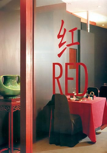
| Simply Red A new restaurant challenges your sensibilities of Chinese dining. It all started out of hunger. Unable to nurse a craving for Sichuan food one evening, fashion designer Allan Chai and his business partner Ross Chng were convinced they needed to open their own restaurant. As they tucked into some food (inevitably of second choice), both agreed that it should be a restaurant that is out of the ordinary. "I will name it Red!" enthused Chng, and with that, the concept for the restaurant was born. Their vision was to create a modern Sichuan restaurant known first for its food and subsequently for its comfort and ambience. To accomplish the "non-Chinois" look, Chng and the design team at HYLA Architects worked on three main colours - red, black and gold - after deciding that monochromatic red would be just too intense for the 60-seater restaurant. The aim was to reinvent these colours' undeniably Chinese characteristic in their favour. Principal designer Yip Yuen Hong says: "The clients came to us with a very clear idea of what they wanted to achieve. Our job was to come out with an abstract, modern Chinese image that was sleek but non-intimidating." Afterall, Chng had emphasised that he preferred a casual dining ambience. The layout of the restaurant is clear, highlighting a simple but elegant linear space demarcated by a luminous "moon gate" that leads to an open-air courtyard. The coloured tempered glass screen near the entrance sets the tone for the interior ahead. Undulating black laminate panels with steel bars add texture and create a contrast to the draped wall on its opposite side. A variation of the Chinese "screen", these openable panels have a practical purpose. They were designed to conceal unsightly electrical control boxes on the wall but Yip went beyond by layering them with interesting results. Due to its bright hue, the more dramatic mango-coloured wall with theatrical crimson curtains tends to elicit notice immediately when you walk in. Chng explained that they were inspired by Chinese opera. He wanted the restaurant to be a setting where the food would take centrestage in a "theatrical" atmosphere. "We have also thought about using the restaurant as an art gallery when there is a chance. Plans to create an outdoor timber dining patio to cater to private parties and functions are in the pipeline. But the focus now is on running the restaurant," he adds. |
From the start, the owners were committed to their first
food and beverage venture. The "moon gate" was personally gold-leafed.
The wait staff each has a dark grey bistro apron with red tips at the
end of the tiebacks, an Allan Chai design. Another distinct feature of Red is its choice in tableware. To deconstruct the common Chinese dining experience, Chng decided to adopt an assortment of tableware in different colours and materials instead of the uniform and clinical-looking sets used elsewhere. He scoured all over Southeast Asia to find uniquely designed pieces in order to enhance the dining experience. Yip says these pieces helped the design team fine-tune the look that the clients were seeking. Depending on your order, food is served on unglazed white ceramic plates with a curved edge, deep red lacquer boxes and fan-shaped trays or bamboo green crackle glazed bowls. The lighting at Red is comparatively more subdued than the average Chinese restaurant. Apparently, its original look was too dim for most diners and had to be adjusted to suit patrons' expectations. Indeed, in Chinese dining, we like to see what we are eating. To the designer's chagrin the lighting at Red had to be brightened to accommodate this diehard dining habit. "The original plan was to have more indirect lighting but it's a tough dilemma," admits Yip. The overall feel of Red is modern but when I first stepped in, it was difficult to decide what kind of Chinese restaurant it was. Upon taking our seats, the first thing that caught my eye was the acid green porcelain vase near the entrance. Despite its size, the sparkling spot of green breaks up the monotony of the richly toned interiors with ease. I thought its unique colour and shape makes it an appropriate metaphor for the restaurant. It is Chinese in essence but it heralds the emergence of a new generation in thinking and tastes. |
|
Reprinted with permission from: Space 2000/03 jun/jul issue Text: Tay Ser Meng Photographs Courtesy of Red |
|
| View Flash Version (Macromedia Flash Player required) | Download Flash Player | back to top |