|
| |
 |
|
| : 17 BOWMONT GARDENS in review |
|
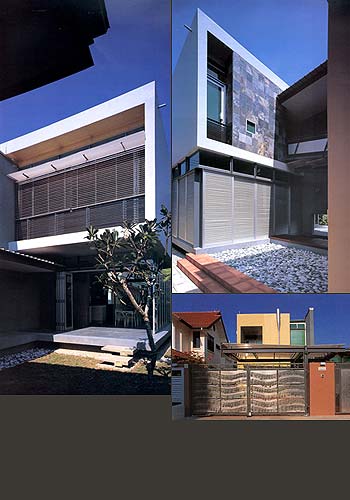
| A Split Within The Whole As most architects resigned themselves to the daily torture of calculating GFA and Plot Ratio, and in the process lose track of their true purpose as an architect and subconsciously surrender their idealism cultivated many years ago as an architectural student, it has become rare to come by any architecture that is truly rooted in conceptual rudiments, except, of course, in competition projects. Hence, it is somewhat refreshing to experience this house by HYLA, which challenges both the definition of tropical architecture and the viability of conceptual architecture, as opposed to jumping blindly onto the bandwagon of minimalism, which has lately become faceless in the crowd. For this is not the first time I have visited, or written on a HYLA design, this two-storey bungalow in the eastern part of Singapore, to me at least, is distinctly HYLA. In fact, to be even more precise, distinctly Han, one of three partners of the firm. A combined effort between Han and his colleague Meng, the bold aesthetics of this house is quite a refreshing change from the minimalist trend that dominates the architectural consumers' market right now. (Note: Occasionally against the wishes of the executing architectural firm.) Here are some common denominators in Han's designs - firstly, the bold use of colours; secondly, the fragmentation of spaces and elements; and the most telling on has got to be the overall organisation of these little fragments into two main "blocks" and the linking of these two by - a "flighting" bridge. As the coined tern suggests, it not only links, but negotiates the difference between two varying floor levels of the two blocks. This bridge serves well as both a visual feature and conceptually conveys movement - an effective architectural element last seen in an A&A job done by Han for a shophouse in Everton Park. From the facades, to the form and the spaces, there is nothing minimalist about this house. The first hint which establishes the design as one that is flamboyant in expression is definitely the augmented (and shapely) rainwater down-pipe. Together with a strategically positioned window, they punctuate and highlight the squarish yellow front fa?de. At this juncture, I would like to share a story that concerns the mismatched front gate, before the more sophisticated might want to scoff at it - so resist for a moment while I relate. The wrought-iron gate, elaborately decorated with the score of "My Blue Heaven", is an heirloom which has been past down to Wenlong, the young master of this house. This gate, apparently was presented as an anniversary present by Wenlong's (obviously suave) grandpa to his grandma, to commemorate an unforgettable night they spend watching a musical. Young, rich and suave·I must say, is quite a potent combination. (*Oops*) Side-tracked ·anyway, frankly, I thought the gate actually makes quite a quaint combination with the house. In terms of the spatial planning, the most comprehensive (and recommended) way is to read the ground floor plan as four quarters of a rectangle, with two major axis, perpendicular to each other. The more critical axis runs along the length, and physically takes the form of a spine wall, whereby the main circulation paths of the house revolve around. The secondary axis is less apparent, marked subtly by negative (void) spaces, in the form of central courtyards, of which there are two. This four-quarter-effect is quite visibly expressed in form as well. So while the key axis mark the main path of movement, the secondary axis demarcates the static spaces. The absence of an obvious hierarchy in the spaces is due to the special brief given by the client - the requirement of two master -bedrooms. One for Wenlong's parents, who are based in Germany and hardly around, the other for Wenlong, who is really the one who lives in the house and naturally deserves a room of substantial size. The equal importance of the two rooms is emphasized so much that everything else around the room seems to accommodate this special relationship. Each master-bedroom seems to be deliberately designed away from each other, one - almost autonomous from the other, and incidentally quite apt for the parents-and-son's long distance relationship in real life. |
Architecturally, a knee-jerk execution effectively expresses
this relationship - by splitting the plan into a front and back "house",
with a good distance between the two by virtue of the two central courtyards.
Hence the imaginary axis (mentioned earlier). While both the "houses" are consistently modern in expression, the articulation of fa?de varies, and hence further emphasized the distinction of the two "houses". It might also be interesting to note that the splitting up of the house into smaller units unified by a courtyard, is a familiar technique used in traditional Chinese architecture, illustrated in Zhang Yimou's highly acclaimed movie "Raise the Red Lantern", whereby each concubine occupies an individual chamber, all of which are physically isolated from the master's main chamber, all of which are physically isolated from the master's main chamber by the distance of the central courtyard. Perhaps this house is another version/reinterpretation of such a split within the whole? Sans the concubines, of course. To break the monotony of an otherwise long and continuous courtyard, to link both the "houses" (visually and physically), to bring movement to contrast with the static elements and to make complete the composition of the plan - hence the central axis of circulation. In fact, the position of this spine wall indicates not just its importance in terms of visual and physical, it gives a much needed focus to the house, and strengthens the conceptual slant of the house. From a less pretentious perspective, the positioning of this key wall could very well be an instinctive act, with none of the above interpreted significance - a definitive position that could be sensed by any discerning architect. While this house might not appeal to some, the commendable thing about it is that it engages the mind, and not just the eyes. The presence of the conceptual is felt the moment I stepped in. A subtle skew of a wall amongst a rectilinear composition begs for an explanation. Closer observation reveals a colour theme in the skewed walls. All these might not be important once the house becomes an inhabitable space, but what matters is that thoughts have been spent on this house and these thoughts have been physically documented through the architecture. And they will come alive every now and then, when someone takes time to read them. While a lot of jaded architects have grown cynical of conceptual significance in a house, and have often brushed it aside as being unimportant, pretentious, impractical, idealistic and a waste of time, what they have forgotten is that, the richness of a scheme, of a piece of architecture, of a space, is always apparent when it is backed by a concept, especially if it is a strong one. What they have forgotten is that beautiful and meaningful architecture is possible. What they have forgotten is that there will always be Hadids and Libeskinds who will put them to shame. What they have forgotten is that architecture without soul is just construction. What they have forgotten is perhaps - the true meaning of architecture. |
|
Reprinted with permission from: iSh no.2 1999 issue Writer: Kelley Cheng Photography: Albert Lim/courtesy of HYLA |
|
| View Flash Version (Macromedia Flash Player required) | Download Flash Player | back to top |